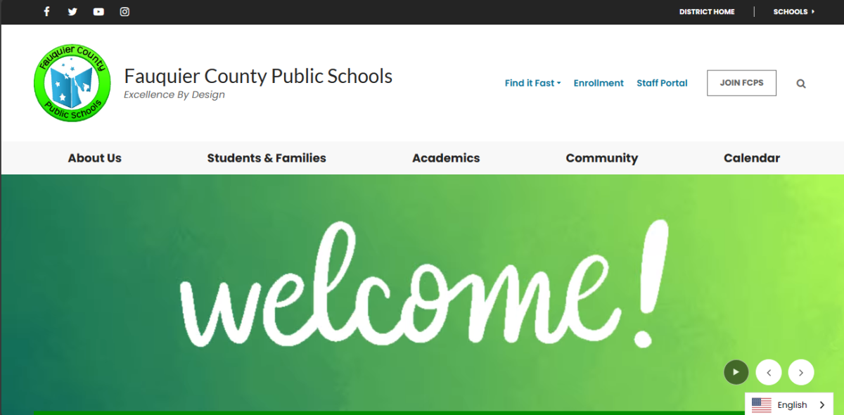
FCPS has had their own website ever since 2002, according to The Internet Archives, an American nonprofit digital library, and it has constantly evolved since then. Throughout the years, it has been updated and occasionally undergone a huge remodel, the last one occurring on Nov. 6th, 2016. This year, FCPS’ website was remodeled yet again to look sleeker and more modern.
The text of the website now has a different variety of fonts when compared to its older self, and the color schemes have some more pop. The white, green, and black colors also provide a more modern look to the website when compared to the old one, ripe with animations for the various open menus. The new animations now do a cool fade in with the bottom of the redirector turning green. How users navigate mostly remains the same, except for the nice addition of a “Find It Fast” button on the top right-hand corner, which you can tap and find SchoolCash online, schoology, and more from the small menu it drops. Another cool feature expanded on and added is the display of direct posts from FCPS’ news Twitter (X) account, along with a more comprehensive and informative upcoming events calendar. The icon redirects have also been changed, such as the tip-line and schoology. Other button redirects such as the enrollment button and the join FCPS redirect are also easily accessible.
Overall, the remodel of FCPS’ website provides easier usability and more vibrant colors that the original website didn’t have. It also provided certain icon redesigns and an overall better look.


